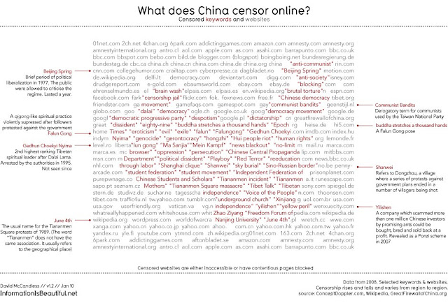
The leading light of the infographics movement in the UK is David McCandless. His recently published book, ‘Information is beautiful’, contains dozens of vivid, modern and extremely smart info-maps, graphs and charts. The subjects dealt with are diverse, from alternative health to the Billion Pound-O-Gram, that displays the vast amounts spent on everything from the war in Iraq to the drug trade using 2008/09 figures from the Treasury.
Mapping all manner of things in this way allows completely fresh way of understanding. Have a look at these stunning examples below and see for yourself.

See more of David McCandless’ infographics on his website http://www.informationisbeautiful.net
Buy David McCandless’ book ‘Information is Beautiful’ on amazon.co.uk
Need to visualise location based data? FIND's consultancy offers map design, digitising and analysis
Buy David McCandless’ book ‘Information is Beautiful’ on amazon.co.uk
Need to visualise location based data? FIND's consultancy offers map design, digitising and analysis


No comments:
Post a Comment